The Weekly Insight Podcast – The K-Shaped Recovery
If you were to turn on CNBC, or pick up the Wall Street Journal, or jump on YahooFinance.com any day this week, we can almost guarantee you’ll hear some version of these two headlines:
- “The U.S. Economy Is in High Gear!”
- “A Recession Is Just Around the Corner!”
The most obvious reason for this, of course, is the financial media’s love of hyperbole. No one clicks on an article titled “Not Much New to Report”. In an era where people are paid by clicks, they’re going to write about the things that make it most likely for you to engage.
But there is another – equally viable – reason for these two themes: there is data to back them both up. And since we don’t have to worry about anyone paying to read this memo, we figured it might be good to have an honest conversation about both sides of the argument.
Which brings us to the title of this memo: The K-Shaped Recovery. What in the world are we talking about?
Economists love to chart things out. And they love to compare everything that happens against the charts of the past. When it comes to economic recoveries, they particularly love their “letters”.
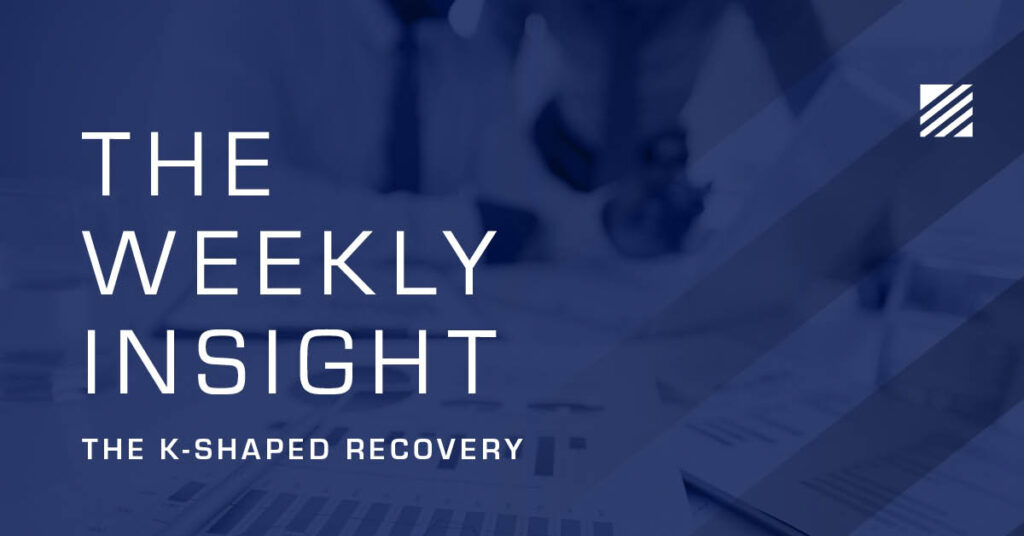
There is the “V-Shaped” recovery when an economy tanks and quickly regains its footing:
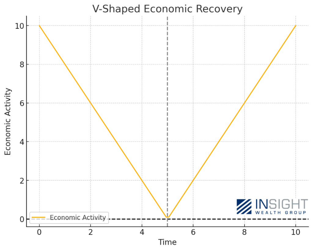
Chart not illustrative of specific example.
Then there is the “W-Shaped” recovery, when an economy tanks, tries to recover, and tanks again before finally pulling back out:
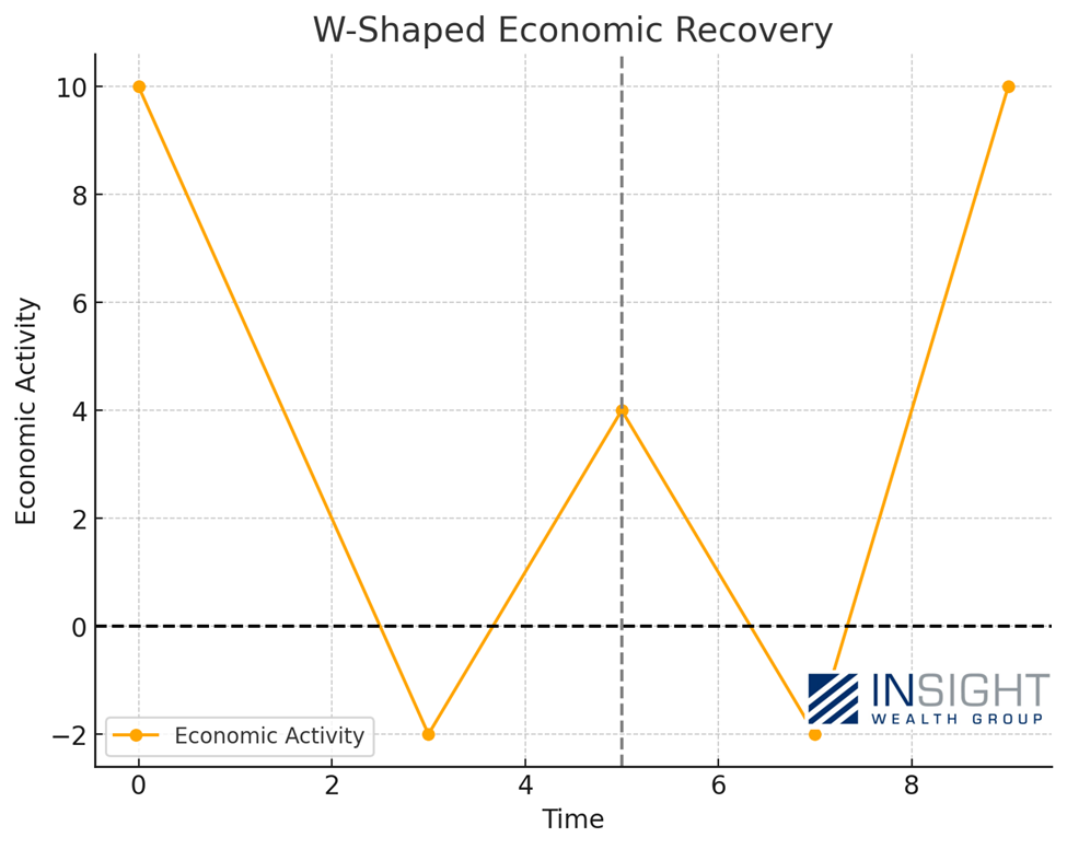
Chart not illustrative of specific example.
Or there’s the never welcome “L-Shaped” recovery. Not good!

Chart not illustrative of specific example.
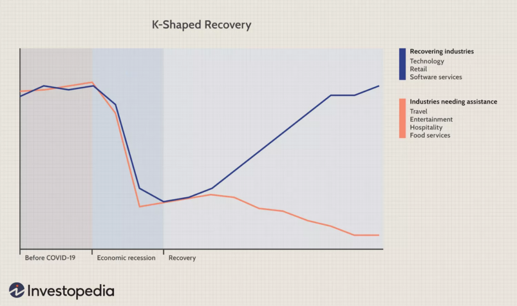
But what if the answer right now – post-COVID – isn’t quite so simple? What if we’re really dealing with two economies? And what if that means predictions for the future won’t be quite as easy?
We think that’s exactly what’s happening right now. In our minds, this means we’re currently looking at a K-Shaped economy today: one in which the haves are doing quite well. And the have-nots? They’re struggling.
Chart not illustrative of specific example.
We saw a specific example of this during the COVID pandemic. The whole economy collapsed – very quickly – but the recovery that happened was isolated to areas of the economy that could still operate while consumers were confined to their homes.
Past performance is not indicative of future results.
We believe it’s still happening– but more broadly. Those consumers and companies that have size and available cash are doing quite well. Those that don’t are struggling.
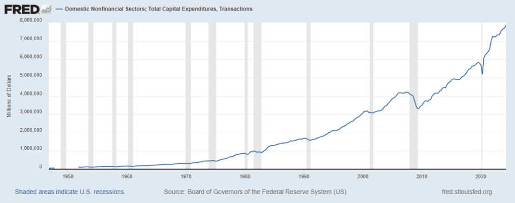
On its face, this economy looks extremely healthy. We can see it when looking at corporate capital expenditures. Not only did they explode after COVID, but they also continue to rise to all-time highs after slowing in 2022.
Past performance is not indicative of future results.
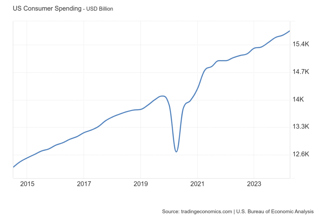
We can see it when we look at consumer spending. We’ve seen no slowdown as we continue to set all-time records. Not bad for the data set that makes up nearly 70% of our GDP calculation.
Past performance is not indicative of future results.
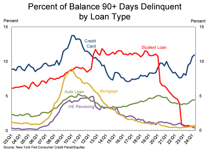
But when we look deeper into the data, we can start to see signs of weakness. For example, we know that credit card delinquencies and auto loan delinquencies are rising. Credit cards have now exceeded where they were during the peak of COVID, and auto loans are nearing their 2019 highs.
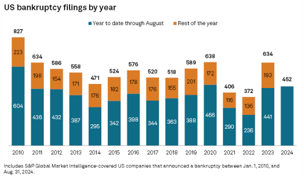
And bankruptcies are rising as well. This isn’t showing up for large cap companies. But small companies? They’re struggling right now. Bankruptcies through August were at their highest level since 2020 and are on pace to exceed the level last seen in 2011.
So how could we have any confidence about the economy when you see these data points? The simplest is by looking at the consumer. Where does consumer spending – again nearly 70% of GDP – come from? It comes disproportionately from the highest income earners.
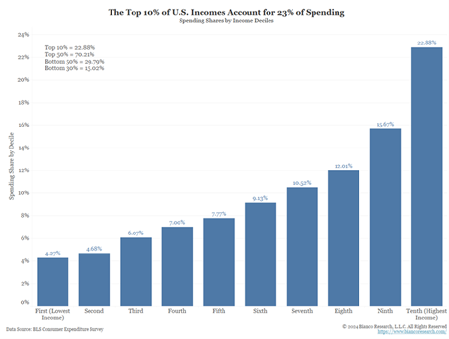
Fully 23% of all spending comes from the top 10% of earners. Over 50% comes from the top 30% of income earners. The bottom 30%? They make up just 15% of all spending.
We know that inflation always disproportionately impacts the lowest earners. Who does a $50 jump in the weekly grocery bill hurt worse? Those who make $30,000/year or those who make $150,000/year? That’s a 2% jump in expenses for the $30,000/year earner – just to eat. That’s meaningful.
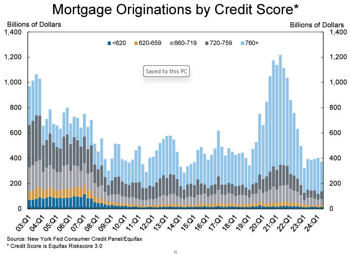
But there’s another important thing to consider: the cost to borrow. Consumers are often smarter than we give them credit for. And those with resources took advantage of low interest rates to restructure their debt during the COVID interest rate lows. Just look at the spike in mortgage originations by those with the highest credit scores in 2020 and 2021. It was not just a record, it smashed previous examples.
Past performance is not indicative of future results.
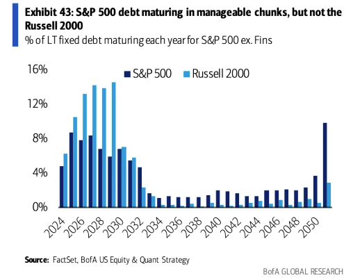
The same goes for big corporations. Let’s imagine the corporate example of the top income earners is the S&P 500 and the lowest income earners is the Russell 2000 (small caps). Their debt scenario is wildly different. During the low interest rate environment during COVID, large companies did just as rich consumers did: they consolidated their debt and extended their maturities. Small companies didn’t have that opportunity. And so, their maturities are looming at a time of much, much higher rates.
The good news? Big companies and big earners are what drive an economy. They create jobs and wealth. They may be able to keep us out of a recession.
But it’s the rest of the economy that is feeling it. That’s why when you run a poll today and ask questions about the state of the economy you get results like this:
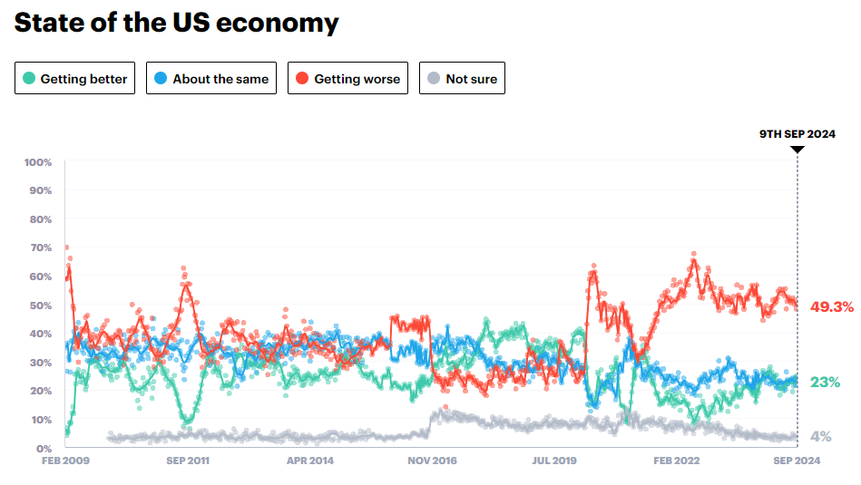
Source: www.YouGov.com
The fact that we’ve had such a sustained negative opinion about the economy at the same time the economy has been growing at a wonderful rate tells us everything we need to know. The benefits of this growth are not reaching many of our citizens.
The solution? Small businesses and consumers are going to be feeling much, much better when interest rates come down. We’re about to learn a lot more about that on Wednesday when Chairman Powell steps to the podium and announces the first rate cut since 2020. We’re also getting a dot plot which should provide the market with some clarity about the direction the Fed is going. We’ll have a lot to report on in next week’s Memo.
Sincerely,