

The Weekly Insight Podcast – The Chart You’re About to See Everywhere
And just like that, we’re in the fourth quarter. Yet another year has nearly flown by. Leaves are turning. The weather is cooling and…if it ever stops raining in Iowa…farmers will soon be harvesting their crops.
It’s a wonderful time of year. But – every two years – it’s when we need to address the one thing all of us are sick of at this point: elections. Don’t turn the channel like you do when those campaign commercials come on – we’re not getting political today. Instead, we want to address the one chart every finance expert is going to start pitching in the next month. And why – no matter the outcome of the election – the old wisdom will be challenged.
Longtime readers of this memo know this: we aren’t here to pick political sides. But we do believe – strongly – that outcomes in Washington have a significant impact on the economy and your investment portfolio.
When it comes to outcomes, none is clearer than election. There are winners and losers. And markets are always handicapping the outcome.
With the handicapping also comes the hyperbole. “This is how markets react to elections.” You’ve seen the chart before: markets struggle leading into elections – especially mid-term elections – as investors try to determine which direction Washington will be heading. And the year after the mid-term is (historically) a barnburner as markets settle into the “new rules” post-election day.
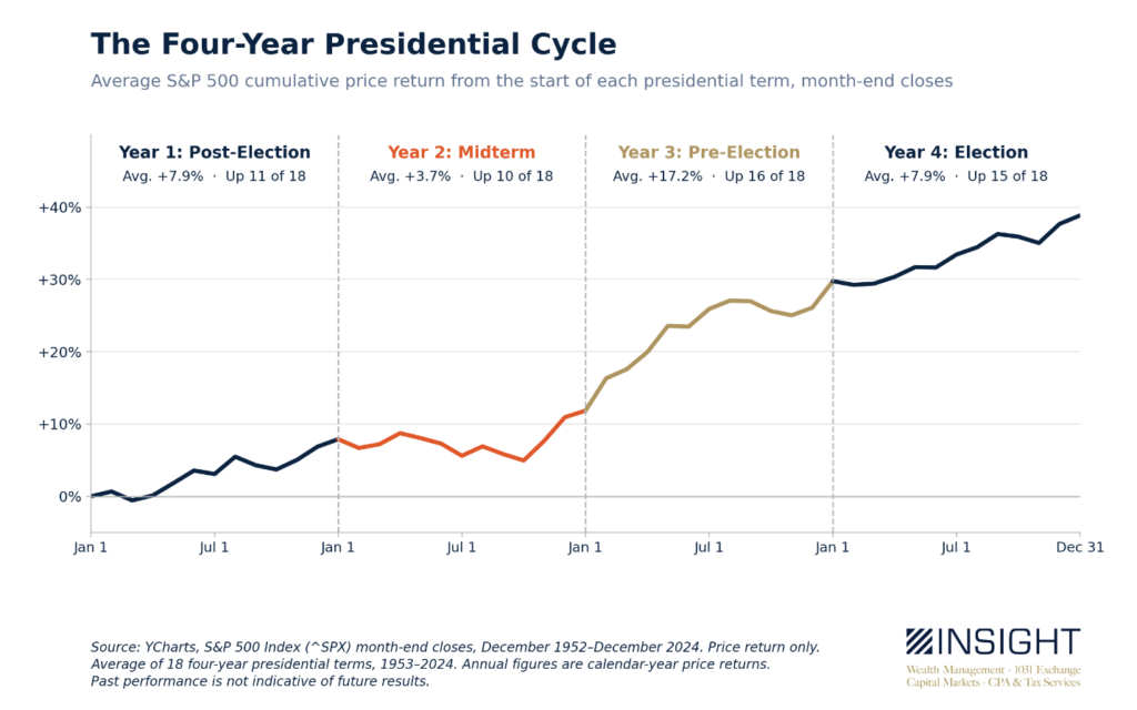
As you can see, the math has truly borne that out. Year two of a Presidential cycle (mid-term year) is by far the worst performer. Year three (next year) is the best.
The rationale maps well to how people perceive markets and politics. It ties back to America’s long-held belief that no person or party should control too much power. Only four times since Lincoln has the President’s party gained seats in the U.S. House of Representatives. And the results aren’t much better in the Senate.
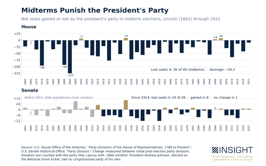
You put these two data sets together and a story starts to appear:
- Markets start to hedge their bets pre-election as the uncertainty (markets HATE uncertainty!) around policy in Washington begins to rise. That creates the negative average for the first ~10 months of the mid-term year.
- Government becomes more divided in mid-term elections.
- The market sees divided government as less likely to make major changes in economic policy and has more confidence in the path for the next two years. Thus, the steep rise in average returns from the time of the mid-term election through the end of year three.
It’s a simple story. It plots directly to our understanding of history and human nature. And the results speak for themselves. And so, the chart you’re going to see everywhere over the next several weeks is this one:
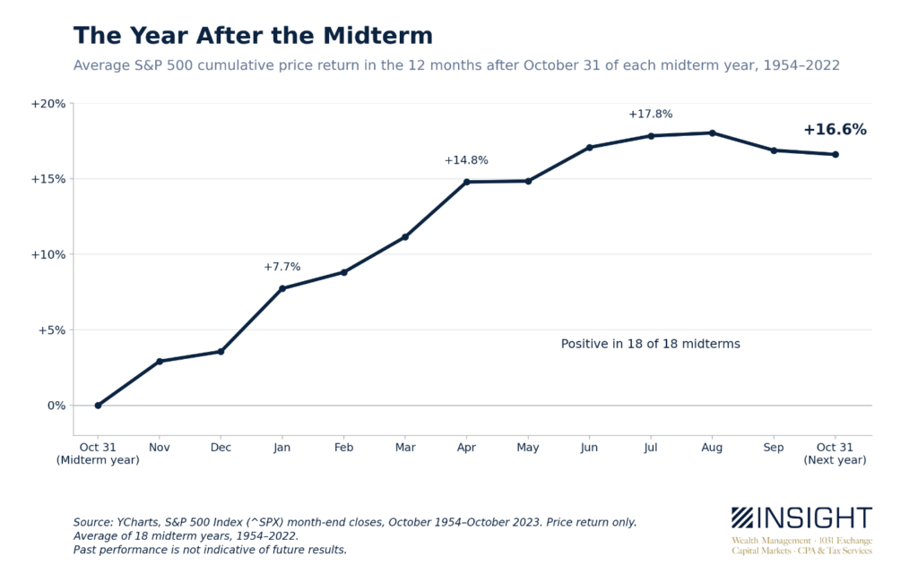
Yay! Here we go! The next year is going to be amazing!
Maybe.
But all this information is showing us is the average. And it’s a long jump from averages to causation. Take this statistic, for example: the average S&P 500 calendar year price return since in 1928 is 8.1%. Not bad. But you’d be wrong to expect that to be your average return. Why?
There have been just 4 years in which the index performed within 1% (7.1% to 9.1%) of that average. The last time? 22 years ago, in 2004.
The average positive year – of which there were 66 – was +18.8% over that time. The average negative year – of which there were 31 – was -14.3%. But even with that preponderance of good years – the compound annual return for 98 years (we had one flat year in 1947) was 6.3%.
The point? Averages don’t mean much.
So, instead, we need to look at this specific moment in time and try to understand what the market may be telling us. And what do we see when we look at this moment in isolation from other historical cycles? It is quite different.
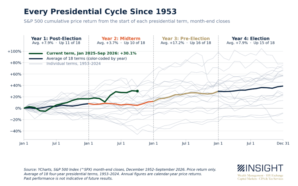
Normally markets stall during Q2 and Q3 of a mid-term year. We had the pullback at the start of the Iran war, but that reversed quickly. The S&P 500 is significantly ahead of the “average” at this moment.
The good news is that the four cycles which have outperformed this moment (the second terms for Reagan, Clinton, and Obama and Trump’s first term), all finished well above the average presidential term (+57 to +78 percent). But all saw significant volatility in years three and four (Black Monday, COVID, tech bubble, etc.).
Over the twelve months after the election, however, three of those four examples significantly underperformed the average (1998 was the exception as the tech bubble was booming before the bust). That leads us into the most important statistic here – and why we need to temper our expectations. One of the major causes of the “amazing third year” is the recovery from the pain of a bad mid-term year. Post-midterm markets have significantly underperformed when there was not a slump leading into the election.
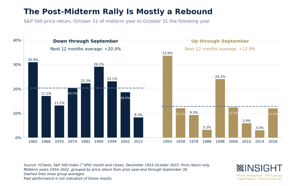
You might also note that some of the worst performing years in both sections of the chart above were the last six mid-term cycles. Over the last six midterms, the market has averaged 10% in the year after the midterm. And in years when the market has been up through September (four of the last five), that number drops to 8.3%.
Again, not a bad number. In fact, it’s nearly exactly the calendar year “average” we talked about earlier. But the important message is this: when you see commentators talking about how the market will get a post-election bump, remember they’re not telling the whole story. Elections don’t cause positive returns. The market rebounds from the volatility elections have historically forced on equities. Volatility the market hasn’t seen in 2026.
Sincerely,