
The Weekly Insight Podcast – This Time It’s Different
The four most dangerous words in the world of finance are simple: This Time It’s Different. Too often, it’s justification for the hopes and longings (or the fears and panic) of investors. In the late 1990s, it was the story of the internet: it was going to fundamentally change the world (it did) and justified the valuations we were seeing in the market (it didn’t). During the Great Financial Crisis, it was the belief by many investors that we’d never again climb out of the hole we dug. And, as recently as a few years ago, it was the belief that we would never see high interest rates again.
Repeatedly, the real world has proven these predictions wrong. Which is why this headline from Yahoo!Finance over the weekend caused our stomachs to turn just a bit:

“The new normal” is a nicer way to say, “This time it’s different”. But it’s the same trope we’ve seen time and time again. And the same one we’ve seen proven wrong time and time again. So, should we take it seriously? Or should we automatically assume it’s wrong? As with all broad assumptions, there is important nuance here to understand.
The Average
You’ve heard us and others talk frequently about the historical averages of things like earnings. “Average” is an interesting statistical term. One time in these pages we noted that the long-term historical annual average return (calendar year) of the S&P 500 was 8.49%. Not a bad number, right?
But can you guess how many years the return of the market fell within 2.00% of that number either way (6.49% – 10.49%) since 1928? In 97 years, it has only happened twice! In 2004 the annual return of the S&P 500 was 8.99% and in 2016 the return was 9.54%. The average may be the average – but that doesn’t mean it’s normal. It’s not normal at all.
So, when we talk about the average price-to-earnings ratio of the market, you need to keep that in mind.
According to MacroTrends.net, the average S&P 500 P/E ratio since 1928 is 17.77x. Clearly, we are far above the average, even if we haven’t hit all-time highs.
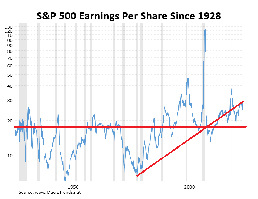
Past performance is not indicative of future results.
But trends matter, too, in this discussion. And there has been a clear trend since March of 1980 when the S&P 500 hit a P/E low of 6.68x.
What Has Changed Since 1980?
Simply put, a lot! There are many of us at Insight who would highlight the 1980s as an idyllic time in America. It was March of 1980 when Michael Jackson first performed the Moonwalk. And in March of 1980, the famous TV show Dallas ended its season with the iconic “Who Shot JR?” episode. It was also the month that Mount St. Helens erupted.
But as cool as those cultural moments are, in retrospect, our economy has changed dramatically since that time. And, along with it, so has our stock market.
In 1980, nearly 2/3 of the S&P 500 was made up of manufacturing companies. Today that number is just 18%. Just 14% of the market was made up of “innovation” companies (i.e., tech). Today that number is 49%.
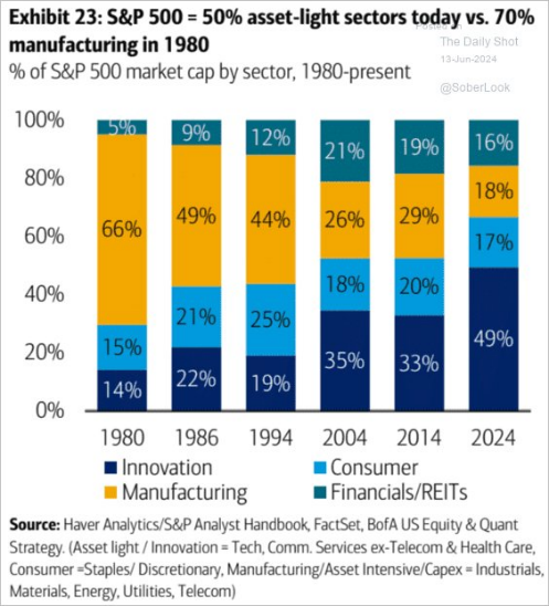
Past performance is not indicative of future results.
The difference between manufacturing and innovation? Manufacturing is significantly more capital intensive. Thus, the justification for higher P/E ratios just doesn’t exist in those companies. In tech, telecom, healthcare, etc. you can much more easily justify higher P/Es as the capital needs are significantly smaller.
So, Is It Really Different This Time?
“Different than what” should really be the question here. Yes, the entire makeup of the stock market is different than it was when we saw the lows of the early 1980s. And it’s also quite different than the extreme highs we saw in the early 2000s. The “extreme” valuations of the world’s largest tech companies are much tamer than what we saw prior to the market’s collapse in March of 2000.
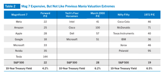
Past performance is not indicative of future results.
What’s probably even more interesting from the chart above is how much lower our tech companies are (ex-Tesla) than the “tech” companies in 1972. Polaroid and their new-fangled cameras and film were trading at 95x earnings! That makes Nvidia look positively cheap!
But as you can see from the chart below, tech companies are a bit out of whack today. The Nasdaq – the standard for “innovation” companies – is significantly higher than its historical precedent over the last 20 years. That’s worth noting.
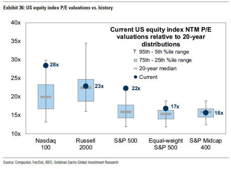
Past performance is not indicative of future results.
But the chart above also shows pockets of opportunity. The S&P500 equal weight is nearly in a “normal” range. And mid-cap companies are absolutely buyable right now (which explains our current overweight).
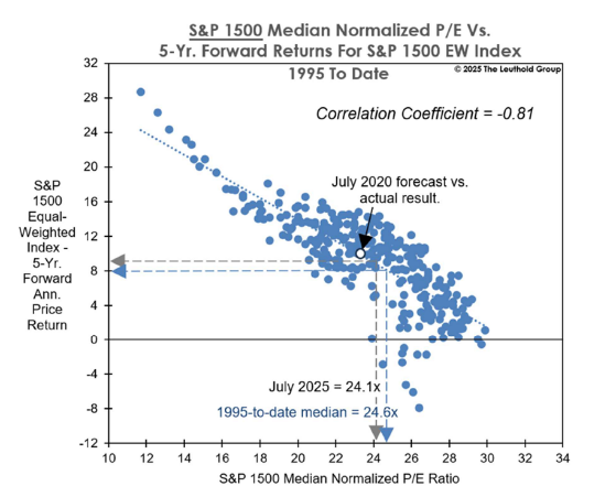
What isn’t different – and likely won’t ever be – is that where you buy stocks matters. And the cheaper you buy them, the higher returns you see over the long-term. The chart below demonstrates this fact very clearly.
Past performance is not indicative of future results.
But what this chart also shows is that at the current levels for the “S&P1500”, the five-year average return has been roughly 8.5%. Does that number sound familiar? That’s right – it’s the long-term historical “average” return of the S&P 500. P/E multiples are something for us to always watch. But they’re not screaming the end of the world today. Even if there is no such thing as a “new normal”.
Sincerely,